
Data Visualisation Rationale
May 7, 2014 § Leave a comment
The data set I’ve collected and demonstrated is consistent of my personal movement over the space of one week. It factors my location, mode of transportation, travelling time, distance, and cost.
With this data, my objective is to create a mobile application that visualises these elements, letting the user monitor their own movement, through an informative and digestible visual medium. As well as displaying geographical data, I’ve incorporated psychogeographical aspects (emotions & behaviors of geography). I intend to devise this app around economic, environmental and social components, these allow for a broader audience, aquainting to all types of lifestyles: recreationally based, economically aware, occupational and professional, healthy, and general also.
My primary body of design is made up of four diagrams presenting the above-mentioned factors, displaying the whole week’s data. A map shows my movement over the week, presenting my trails of which show frequency of travel and by which means of transport, apparent via colour and opacity. These diagrams are all displayed on a poster, as well as displaying particular days and specific transportation.
The application of this is put into ‘Flux’, meaning continuous movement, a lifestyle-monitoring app, incorporating social media, stemming into the realm of psychogeography.
Frame working my data set this way seems to have been an effective route to take, I feel the representation of my data, and the given context of my work effectively communicates information, and relates to an audience.
App Poster
May 7, 2014 § Leave a comment
I decided I’d also create a poster of dedicated to the diagrams, only slightly altering the layout to fit the page and format appropriately. I also thought it would be a good idea to show the individual days mapped out, as well as the individual transport methods totals over the week.
Click this link to see high quality poster PDF here where the colours are not corrupt.


App & Icon Sketches
May 7, 2014 § Leave a comment
These are the initial sketches created showing the content, layout, and iconography of the app:


Giving Meaning to My Data / App – Project Proposal 3.0
May 7, 2014 § Leave a comment
The theme for this project is movement and transport, specifically my own movement and the modes of transportation used. I’ve gathered information and statistical data using a mobile app called ‘Moves’ which has been tracking my movements over the period of 2 months, gaining such data including distance travelled, time spent travelling, calories burnt doing so, and steps taken, via different methods (where applicable). As well as this, I’ve created an online survey asking questions about peoples movement, and the cost of doing so. I’m practically playing to my strengths as I’m utilising data that I’d already began collecting, as well as this being an area I was generally interested in. The context for this project is mainly looking upon my personal movements over different time frames. I would like to show a narrative of my own movements, which are dictated by the availability of transport to my destinations, in confluence with flexibility, efficiency and cost. I believe I have an extensive amount of data of which is quite flexible, allowing me to experiment in various ways, gaining a range of interesting results. I would consider the data I’ve collected to be intellectually lightweight due to the technological assistance, but it’s what I do with this data that will prove the challenge. The audience for this project is primarily myself, however from the results collected from my survey, it would appear I have an audience of both male & females, of whom are in the age band of 18 to 25 (predominantly).
With my data set, consistent of personal movement, I initially found it quite difficult to contextualise it to something, mainly due to the fact that this data is totally made up of my own individual movement. I didn’t really understand how tracking my own physical motion across distances could actually be related to anyone else, though I eventually realised that this data set could be applied to any one individual that wanted to gain the same outcome as I did, which was a journal of my moving habits, which gave me an insight into my own lifestyle, through a combination of choices, habits and commitments.
Name ideas:
Motion
My Motion
Constant Motion
Dynamics
Shift
Flow
Flux
“The action or process of flowing or flowing out”
“a flowing or flow”
“a continued flow”
“continuous change, passage, or movement” – is the flow of a physical property in space, frequently also with time variation
On app show a single day with all the details: emotions, reasons, etc,
The App
Name: Flux
Flux: “continuous change, passage, or movement”
I’ve chosen this name as I feel it fits the characteristics of the app appropriately, as well as it sounding very fresh and intriguing. It’s a nice, short and snappy name, which I feel I can create a nice logo for also. The other names I had to offer I felt were maybe a little too generic.
What does it do?
The flux app monitors a users’ movement, displaying visual data of their tracked motion through a variety of visual diagrams. These diagrams will display method of transportation, distance travelled via each mode, time spent travelling via them, the cost of travel, and a map based diagram displaying exact movement routes via their phone’s GPS, accompanied by a visualisation of most travelled transport method. The app allows for the user to gain an insight into their economic, environmental and social factors in their life, allowing for their lifestyle to be monitored and graphically displayed in an in depth yet digestible format. Through the apps ability to give this information, it can be suited to all types of lifestyles, recreational/hobby based, sporty, environmentally conscious, economically aware, occupational, professional, healthy lifestyles, as well as the general; people who simply want to become aware of their lifestyle, to see where they fit, be that a common, or more niche manner of living. This app will allow for the user to pick up on their own lifestyle trends, trends they may never have even thought about; theirs also the possibility that it could alert them of unhealthy lifestyle trends and habits, giving them the realization they should pursue a more active way of living.
ECONOMIC / SOCIAL / ENVIRONMENTAL
Features
– Ability to create notes through the day (like a diary) > Psychogeography: reasons for travelling route, how you’re feeling, weather
– On / Off map (pretty design) – detail vs. Beauty
– Share with social media:
– Interlink with ^^, e.g. take photo with instagram, adds it to the map of your movement, Twitter, Facebook, Google + status locations
– Choose specific days / weeks / months to view + specific specific methods of transport
– compare with friends
Audience
Primary audience is young adults aged between 18 and 24 (based upon my survey results), who want to observe and monitor their lifestyle activity
With my set of personal data
Geographical / Psycogeography / lifestyle – sport /
Theme: lifestyle activity
Who : me, though the audience would be focused on young adults aged between 18 and 24 (based on my survey results) who wish to observe their lifestyle activity,
What : monitoring of movement via different modes of transport
When : data from 24th August until 22nd October
Where : everywhere I have travelled
Why : to monitor my own lifestyle activity, observing economic, social and environmental factors. People can gain an understanding of why they travel the ways they do, and if they can change their habits to be more healthy.
How : using ‘Moves’ app, then transcribing the data collected onto a spreadsheet, creating visualisations with that.
People can gain an understanding into their own lifestyle activity, making them question ‘why?’
Flux
May 7, 2014 § Leave a comment
Here I’ve created an advert like promo for the app, describing it’s function, capabilities, and features. Below that I’ve got the app mocked up on the new iPhone.
For some reason all of the colours have been affected by something, making them much more fluorescent and sickly than they’re meant to be, however I can’t change this… I think they’ve been converted from their native CMYK colour state to an RGB colour scheme.


App Creation
May 7, 2014 § Leave a comment
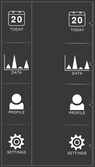
With my app design I wanted to go a minimalist route, using the same colour scheme as I’ve used throughout my design process thus far. A dark grey background will run fluently through out the app, as in all my other designs; this seems a logical thing to do, as well as it complimenting the design well. I will retain the same typeface as I have done with all my designs: Helvetica light, with a widened tracking. The app colour scheme is a basic white and grey, with dashes of my diagrams colour scheme: cyan, magenta, yellow and green. The layout comprises of the menu bar at the top of every screen, containing any relevant icons (depending on the page), separated by a white line which fades at the ends. This white line is used throughout the app at various lengths and fadings.
App Features:
top bar buttons (search etc.), swipe out menu, scroll down on friends/journal (with added fade)
Today / Data : buttons/icons/statistics > link to data – tap to add/remove data – pinch to zoom ___ Ability to turn on/off social marks (facebook/twitter/flux) to bring up the icons – with the journal button.
The days will only display the information relevant for that day, so if you didn’t cycle that day, there is no summary for cycling.
Map routes and data can be separated via the pressing of coloured buttons, representing modes of transport.
I created a better key for the diagrams, where you can instantly tell which colour corresponds to each mode of transport via the icons on the coloured buttons.
‘Buttons’ to switch on/off modes of transport on diagrams and maps
– ‘Simplify’ icon swtich to add/remove diagram details, allowing for pure design view over data view
Comparison:
The comparison feature can show you two days/weeks/months/friends, and gives you the ability to compare the data. For example, if you go to the ‘friends’ page, there’s a search icon, allowing you to search for specific people
Where there’s the availability to use one of the app’s features through another, the feature icon appears at the top left of the screen, predominaintly being ‘compare’ and ‘search’
Timeline:
Here’s a high quality PDF to view of my app screens

The top menu bars + icons

The swipe out menu used
unused variations of the menu

Variations of the time switch

The ‘Today’ main screen, showing the ability to turn on/off specific routes/transports, as well as view the social journal entries
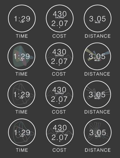
Variations for the Time / Cost / Distance icons

Layout variations of the social bubbles, displaying time and icon also

The new icons representing each mode of transport, with a overall total number in the middle
-

- Login
-

- Pull out (swipe) menu
-

- ‘Today’ main page
-

- Today page with journal entries activated (bottom left) + select transport
-

- Time diagram
-

- Simplification button/function (bottom left)
-

- Cost diagram
-

- Cost with select travel methods
-

- Cost simplified
-

- Distance diagram
-

- Zoom capability + dimming
-

- Distance simplified
-

- Map diagram, showing most travelled methods
-

- Zoom & twist funciton
-

- profile
-

- Friends
-

- Compare
-

- Compare screen, tilted + select days
-

- Timeline, signifying most travelled transport + best
-

- Journal
-

- Settings
-

- Preferences
-

- The full data screen (scroll)
App Icons
May 7, 2014 § Leave a comment
when creating my icons I wanted them to be easily understood, simple, and retain a consistency throughout.
This is the icon set I’ve created for my app, A1=top left C5=3rd along, 5th down etc. :
A1: Data – represented as a bar chart (or my cost chart)
A2: Today – represented as a calendar
A3: Flux icon
B1: Journal (off) – represented as a book and pen
B2: Journal setting on – represented the same, but inverted
B4: Motor transport – represented as a car
B5: Cycle
C1: Timeline – represented as a clock with an arrow
C2: Search – represented as a magnifying glass
C3: Skateboard
C4: Skateboard v.2
C5: Walkling – represented by footsteps
D1: Profile
D2: Compare – represented as a set of scales
E1: Friends
E2: Back arrow
F2: Settings – represented as a cog
Bottom right cluster: social media icons – represented within a bubble icon

I
App Logo
May 7, 2014 § Leave a comment
These are the sketches I initially made to possibly use for the app, I wanted to use the colour scheme I’ve used throughout somehow, while maybe showing movement too, via connecting the letters.
I made my own basic typeface, experimenting with frequency, stroke weight, colour, rounded & pointed edges, and blend modes.
I settled with the basic typeface, but used the X within it to represent the movement aspect of the app and its functionality, where each line is a different colour, representing each mode of travel. I brought these together using the multiply blend mode ti gain the same colour of the background colour I’m using for my designs. This was then used as the centre piece to the logo, using the characters on either side of the design to form the name. My second design option would have been the stubier version, with the text sitting inside, however, I feel the 4 long coloured strokes meeting in the middle accurately represented the map’s (diagram) routes.


The starting logo / typeface

Variations

The logo ideas that led me to my final design outcome


Experimenting with layout


The second option I left behind

The final logo design
Finalising Diagrams
May 7, 2014 § Leave a comment
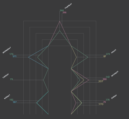
To finish up the diagrams I still needed to fully apply the textual aspects, these being the numbers of my data set, and the days. I wanted to keep a uniformity with the typographical aspects, deciding upon the use of a classic typeface: Helvetica, but using a lighter version of it. I set the tracking to 100, to add a bit more distance between the type, making it feel more spread, rather than compacted, and retaining the same type size throughout my designs.
For the time diagram I aligned the text along each line, which represent a day, of which the labelling would very make clear. I’d make sure the types baseline shift was at a comfortable level which worked well with the design, merging it. The labelling of the textual data also follows the same layout as the day tags, with a decent gap between each. To finish this diagram up, I added a subtle fade to the end of each line that corresponds to the days, making it ease out.
The distance diagrams text was set up to differentiate from the time diagram, but also for it’s practical aspects. The data from the time diagram is plotted along a line, but in the distance diagram it is plotted within 1/7th of the circle. For this reason I added the day annotation along and around the sections, so again it’s easy to understand and read, clearly showing the viewer what days are which. The numbers (previously mentioned in it’s sole blog post), were stacked within the radial guides, but aligned horizontally, keeping the colours ordered the same (in a circular motion) on each day. I made the radial framework very subtle, getting less opaque as it expands, meant to represent a sonar like diagram.
I decided to revamp the cost diagram, as I felt it was too boring, it looked like a rather bar chart diagram, and also it was too wide. I changed this by contorting the diagram, bending it over so it almost turned into a bar from a bar chart itself. This compacted the design to making it better in my opinion, and moving away from the typicality of a bar chart. Upon doing this, I also wanted to move the day annotations, as they seemed to extrude far too much for my liking, so I wrote them in shorthand (to fit) and applied them underneath the data plot, rather than on top.
I removed all of the frameworks and writing from the diagrams to leave behind just the design itself, which I thought looked rather nice, and I might implement somehow.


The old version I adapted upon

The new design, a more compact look


Key / Legend
May 7, 2014 § Leave a comment
Since I’ve now finished my diagrams, I need to create a key to show what corresponds to what, and also the total data for each method of transportation in each category. These are some ways I could show this:


You must be logged in to post a comment.