
Power Our Lives – Typography Investigation
November 22, 2014 § Leave a comment


Competition Brief Rationale – XL Recordings
May 14, 2014 § Leave a comment
I’ve chosen Tyler, the Creator, the event consisting of him performing at MTV’s VMAs, winning the accolade of Best New Artist, with the Moonman award.
The primary aim is to demonstrate the event of the artist in a way that portrays traits of the artist’s personality: free, fun, and quirky. I also want to follow a similar style to Tyler’s design work, which uses a rough collage style, cartoony illustrations, and bright colours; I will use a cartoony illustration style to represent this. I intend to incorporate multiple aspects of the artist, to add more personality to the design. I also intend to add typographical dimensions to the work, using one of his quotes or lyrics, which suit accordingly.
The poster I’ve created follows a quirky and whimsical design process, presenting playful illustrations, and text aligned in an offbeat fashion. The main element of the poster is a representation of the Moonman award, in the form of a donut; this is a stylistic approach to Tyler’s Odd Future logo; the XL logo uses this style also, and another of Tyler’s type styles. The moon man illustration also embodies an inverted cross, one of his signature icons. The quote I’ve added is taken from the lyrics of his song Yonkers, which I feel synergistically fits with the event at hand. The type used is a light hearted and fun, while being easily read.
I think I’ve effectively portrayed the event of the artist in question, all while interpreting the artist’s personality.
Poster Final + Mockups
May 7, 2014 § Leave a comment
Here’s my final design, revised. The brief also mentioned the use of the design being used upon digital outlets, so I mocked up the design on to these mediums also, as well as an actual poster form of it.
A PDF version is available for each by clicking on the images


New Poster Devlopment
May 7, 2014 § Leave a comment
idea – donut man – collage, going back to what i said I’d do, fun and quirky
So, since my last poster was a generic piece of shit, I wanted to create a new one, that followed the style I originally wanted to progress with, the whimsical and playful looking style. I liked the idea of progressing the cartoony donut style, this time using it in a way that’s more substantial to the matter at hand: celebrating the artist, in Tyler’s case that’s celebrating the MTV Moonman award that he won for best new artist. I used this in my last design, but it was far too subtle to be recognised, so this time I made it the centre of attention. I used the same process I did with the modified XL logo for the moonman, outlining (roughly, on purpose) then adding a 3D layer. I tried various thicknesses for the 3D, and settled with the one below which seemed to work most effectively. I wanted to still incorporate the inverted cross prevalent in Tyler’s designs, but thought it didn’t really fit as part of the flag pole, so I decided to instead move this into the centre of the Moonman’s chest, which seemed a little bare anyway. I tested a lot of different compositions, arranging text alternatively, playing with size and angle. I wanted to get more of a playfulness out of the text, so I used a handwritten looking typeface ‘Brain Flower’, and positioned them to get the look that they’d just been placed there, or are bouncing around freely. The colours used mainly derive from Tyler’s colour schemes, however the final poster colour is just a complementary colour of the pink within the design, which works harmoniously with the rest of the design. The gallery at the bottom contains these developmental factors.
“They success is the best revenge”
These are the lyrics I’ve in my new poster. I feel these best fit with the matter, working very well with the event and the award.


Final Poster
May 7, 2014 § Leave a comment
This is a poster I rushed together simply to actually have something to show for my formative assessment of this brief… The reason for the poor quality, is mainly because I made it in about 2o minutes (to be honest…), but this was because I was dedicating my efforts to the main brief; data visualisation. This was because it was meant to be handed in by the 6th March, however has now been pushed to the 8th May, so I could have dedicated my efforts to this brief… however I will create a new poster in it’s place.
All in all the poster lacks concept, has no real design lead, and is pretty damn generic, as far as generic design goes… Though there is actually more to it than meets the eye, however one must need to know the artist quite well to understand. there are three of his style of typefaces used, the XL (donut) logo + the Recordings part of it in another, as well as his name in Cooper Black. These follow a colour scheme related to the artist too. The hat motif is that of the award he won, which is coloured with a tie dye pattern; Tyler was wearing a tie dye t-shirt when he won the award. The award icon also incorporates an inverted cross in the pole, another reference to the artist. The colour scheme used in the text references Tyler too, as does the background, the colour gradient used is the same as a colour gradient often used for his OFWGKTA logo. The way I’ve done it is to show Tyler’s split personalities, his lighter side and darker side, this has been represented as showing a 50/50 split of the design being dark/light. Finally, I used the background texture I have as it added some sustenance to the design.
Poor effort, but I’ll have another crack at it.


Testing different background textures for the poster, as well as different filter blend modes for the gradient.

Trying different colours out for the illustration of Tyler

The reference to the gradient I’ve used


Different textures tried for the moonman, referencing Tyler’s print patterns
Devlopment
May 7, 2014 § Leave a comment
Here’s some progress I’ve made with the brief. I created three illustrations of Tyler, the Creator, each showing a different side to him, a different personality or trait. With these I wanted to demonstrate his multiple personalities he has, as he clearly talks about in his music. The first illustration represent Tyler in an aggressive and angry state, this is his emotional side, the second illustration is an interpretation of ‘Wolf Haley’, his alter ego which is all the evil in his life, and the final illustration depicts Tyler in a happy state, or can be seen as ‘Dr. TC’ (Tyler’s subconscious). I’ve intentionally left the eyes out, as this is another theme that runs through Tyler’s work and style, his illustrations and photo manipulations will often have the eyes cut out of faces, and even often have his eyes shown as one solid colour, as in the ‘Yonkers’ music video.
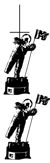
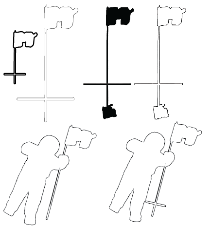
I needed to link the poster to the actual event — him winning the MTV Moonman award for Best New Artist — so I created some sketches of this figure. I also wanted to implement another characteristic of Tyler’s work into this, so I managed to sneak in an inverted cross within the pole of the Moonman award. To actually insert this Moonman into the design, I decided the most fitting place would be Tyler’s cap, where a design would usually sit; removing the original logo I’d made and replacing it.
The last image shows another possible design outcome, using these illustrations.


Typography Experimentation
May 7, 2014 § Leave a comment
I decided to implement the Odd Future donut logo in my design somehow, as I like this logo, and thought about transforming the XL Recordings logo using this illustration style. I tried the 3D in 2 different ways, a thinner and a fatter version, the thinner version looked awful, so I instead used the fatter design. I wanted to use a different type set for the Recordings part of the logo, experimenting with various sketchy and hand written like fonts, I decided they could be better. I incorporated the ‘Golf Wang’ type for the Recordings part of the XL logo, which seems to work well. I also looked at the use of the bold Cooper Black font, which Tyler has recurring though his works frequently. I’ll see how I fit these into the my poster design.


Devlopment and Illustration
May 7, 2014 § Leave a comment
I started creating more little illustrations that reflect Tyler’s work, using inspiration from his designs. I looked at pattern use, and developed a pattern from the rainbow of one of his motifs, could use this as a background maybe?
The third screenshot down shows a page that Joe suggested I screenshot, as this is sort of the style I was going for, a rough composition that works. In all honesty I just threw the designs on the page without thinking about composition, but apparently it turned out pretty good haha! It shows a whimsical and free look, though there’s a fine balance between good and bad with this sort of style.
I’m going to look more into the use of typography, having recreated one of his OFWGKTA logo fonts.

An album cover Joe showed me, showing rough design style, that’s messy, but looks good


Ideas
May 7, 2014 § Leave a comment
I said I wanted to look into the use of patterns, so I created some abstracted patterns using animal prints. This idea came from Tyler’s use of animal furs and prints in his clothing range, though I don’t think I’m going to progress anything with this idea, it was simply a random idea.
I also began some basic illustration stuff, which I plan on doing some collage-y eque like design, gaining a rough cartoony style. I’ll also start looking in typography use.


Research / Jason Munn & Little White Lies
May 7, 2014 § Leave a comment
Some work I really like, Jason Munn’s one of my favourite minimalist artists, his concepts are incredibly clever, but very simple. The Little White Lies magazine covers are brilliant also, so all of this is inspiration for my own work.


You must be logged in to post a comment.