
Text & Layout
May 6, 2014 § Leave a comment
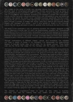
I’ve decided to incorporate a couple pages of text in my poster series, one being used as a sort of ranty essay style piece of writing, and the other as a context forming piece, allowing for the audience to fully understand the depth to my design work.
In my feedback it was also mentioned that it was unclear of what my taxonomy actually was, so I decided to implement each cap.
These are the layout options for said text:


Extra Designs
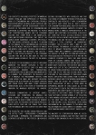
May 5, 2014 § Leave a comment
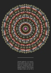
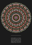
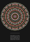
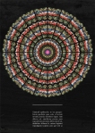
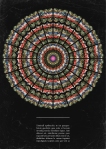
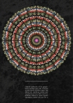
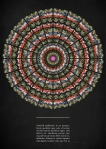
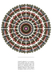
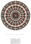
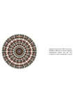
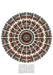
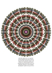
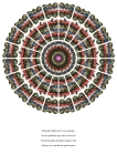
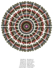
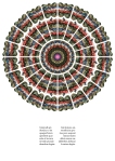
These are the additional 6 mandalas I’ve created for the use in my final designs, all unique in their own way, most using different methods of design. Now that I’ve created these, I can apply them to the final posters!


Poster Colour & Texture
May 5, 2014 § Leave a comment
As far as colour is concerned, after experimenting, I’ve decided that the darker colours work best with the imagery. Dark colours compliment the design greatly, making it more prominent as a result of the darker tones. Lighter colours appeared to retract from the design, in my opinion, thus the reason I shall not be using them.
With dark backgrounds comes light text, in this case: pure white, making it appear more distinctive.
I experimented with a range of background textures to see if they at all harmonised with the design. Textures I tested included materials such as papers and other fabrics, wood, wall textures, painted textures, and grungy textures. I found that the grungy/warn texture effects gave the design some extra depth and personality, gaining a dark under tone, to the already bleak wording used.


Poster Typography & Stroke
May 5, 2014 § Leave a comment
For typography I experimented with a variety of type faces, including both serifs and san-serifs, and more quirky type sets; each with both lower & upper case lettering. I experimented also with the text alignment, justification and size.
The large bodies of text on the 2nd and 3rd pages I’ve used lower case type, as this allows for much more comfortable readability, making the whole thing easier on the eyes, since it’s quite a scale of text to digest. For the captioning I’ve chosen to stick with a fully capital case set, as I feel this emphasises the statements, messages and quotes and their meanings; also it retains a certain consistency that works rather well with the rest of the design. I used three vertical columns in a grid layout, stretching from the top to the bottom of the page, respectively, to accompany the masses of text on the first few pages. This design layout gave the most appealing visual structure, while still allowing for good legibility; there’s a nice flow of design this way. For the captioning, I used a single text box which mainly had central alignment of text, keeping the symmetrical balance aspect of the design process. The rest of the text was justified, presenting neat columns of text on the first pages, and where applicable in the captions. To make the text really ‘pop’ out, I chose to use white as the type colour, any other colour seemed to retract from the design, I want the main focus to be on the designs, not the text.
I felt there could be a subtle addition to the design and text, this would become a faint white line, creating a sort of union between the two. I played around with other border styles and stroke properties, settling with the singular white line.


Taxonomy Rationale
May 5, 2014 § Leave a comment
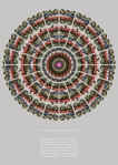
Using my taxonomy collection of bottle caps, my paramount aim is to inform and enlighten people of the darker side of to the particular subject of consumerism and capitalism, and the consumer culture attached. The subject is to be communicated through the (predominantly) branded bottle caps, creating a branded mandala (a religious art form found in the Buddhist and Hindu faiths) in combination with a small body of text commenting on the subject matter. All of this is portrayed in an oxymoronic and satirical fashion, displaying an immense contrast, yet illustrating some comparisons also; between religion, cultural ways of life and thinking in different parts of the world (with focus on consumer culture in the West (mainly)), and thoughts on money and exploitation. With this I hope to give some deeper cultural insight to people, showing the shadowy nature of corporations, deriving from the western world, and their harm to the third and second worlds, making the cultural aspect relative to everyone on this Earth in some form.
My design outcomes are presented in a 13 poster (A1) series, including a title page, two pages of dialogue gaining context, and ten pages of mandala designs accompanied by text. A small magazine/book is also presented with this same content.
I feel the message I’m communicating is portrayed in a meaningful, multi-cultural, and clear manner, through a dark wittiness, and anti-advertising techniques, all lending to an effective design outcome.
Typography
May 5, 2014 § Leave a comment
For typography I experimented with a variety of type faces, including both serifs and san-serifs, and more quirky type sets; each with both lower & upper case lettering. I experimented also with the text alignment, justification and size.
The large bodies of text on the 2nd and 3rd pages I’ve used lower case type, as this allows for much more comfortable readability, making the whole thing easier on the eyes, since it’s quite a scale of text to digest. For the captioning I’ve chosen to stick with a fully capital case set, as I feel this emphasises the statements, messages and quotes and their meanings; also it retains a certain consistency that works rather well with the rest of the design. I used three vertical columns in a grid layout, stretching from the top to the bottom of the page, respectively, to accompany the masses of text on the first few pages. This design layout gave the most appealing visual structure, while still allowing for good legibility; there’s a nice flow of design this way. For the captioning, I used a single text box which mainly had central alignment of text, keeping the symmetrical balance aspect of the design process. The rest of the text was justified, presenting neat columns of text on the first pages, and where applicable in the captions. To make the text really ‘pop’ out, I chose to use white as the type colour, any other colour seemed to retract from the design, I want the main focus to be on the designs, not the text.
Poster Designs
May 5, 2014 § Leave a comment
Here’s a link to ,my final designs in a high resolution PDF form
I also mocked up the results onto some posters:
Colour & Texture
May 2, 2014 § Leave a comment
As far as colour is concerned, after experimenting, I’ve decided that the darker colours work best with the imagery. Dark colours compliment the design greatly, making it more prominent as a result of the darker tones. Lighter colours appeared to retract from the design, in my opinion, thus the reason I shall not be using them.
With dark backgrounds comes light text, in this case: pure white, making it appear more distinctive.
I experimented with a range of background textures to see if they at all harmonised with the design. Textures I tested included materials such as papers and other fabrics, wood, wall textures, painted textures, and grungy textures. I found that the grungy/warn texture effects gave the design some extra depth and personality, gaining a dark under tone, to the already bleak wording used.
The first gallery shows colour, the second: texture, and the third the chosen texture and various shades of grey.
Poster Layout & Design
May 2, 2014 § Leave a comment
For the layout I needed to consider the orientation, sizes of images and text, alignment, symmetricality, details such as borders, , spacing, colour, texture, typography and its justification. The below sketches show my initial roughs of what I could possibly do concerning, with the gallery showing a digital library to choose from, exploring the above factors.
I felt there could be a subtle addition to the design and text, this would become a faint white line, creating a sort of union between the two. I played around with other border styles and stroke properties, settling with the singular white line.


Context
May 1, 2014 § Leave a comment
The context to the bottle cap mandala print series derives from my own expression of personal views of consumerism and capitalism, strongly associating myself as being an anti-capitalist and anti-consumerist. With my design work I want to illustrate the message to people that corporations, brands, and the consumer culture that comes with it, are manipulative, lying, and deceiving creations, that exploit third world (and second world: China) countries intensively. I want to inform people of the damage that consumerism and capitalism has on the world through a synergy of images and text. The result would create a kind of narrative, whereby a story would unfold via a combination of these words and designs. The imagery displayed is that of my collection of bottle caps (of which are predominantly branded with Transnational Corporations (TNCs)), which have been manipulated in a manner that represents the religious art of a mandala, of which is the main artistic form found within the Hindu and Buddhist religions. Mandalas are also present in the Jewish, Christian, and Pagan faiths, and many other religious orientations also. In the faiths of Buddhism and Hinduism, the mandalas represent the Universe. Through combinations of different shapes, colours, and formations, the mandala can mean a variety of things; in my context I’m using the ready-formed designs (of which I’ve digitally manipulated) of branded bottle caps, as the basis for my design process. These bottle caps are the things that speak for the mandala with the context I’ve given them. The mandala use and the bottle caps present a conflict, an oxymoron, a total contrast; this is exactly what I want to gain in my design process. The mandala is a sacred and holy design presenting purity, wholeness, friends, family and community. Corporations, on the surface, in some way or form may represent these qualities, but the reality of it is they are the complete contrary to these. They drive people apart by causing general (and social class) competition between people over material goods, where vanity takes rule. They destroy and exploit human lives out of the corporations’ country of origin, taking advantage of people who aren’t their ‘own’ in the third and second world . They void many of these workers of their basic human rights, exploiting them, leaving them to work in incredibly unsafe and poor working environments, making them far exceed the standard working hour regulations, as well as there being an exponential amount of child labor; all of this often leading to death. They demolish flourishing rainforests and variety more of natural habitats, the lungs of our planet (!), simply to make way for their factories, further ruining it by polluting it with harmful intoxicants and waste. On top of all this, many TNCs will deplete local villages of their natural local resources, often being groundwater. All this damage to the world and fellow human kin caused merely to maximise their profit margins. Where there’s profit, there’s deficit.
The majority of corporations mean no good, all they mean is business, and they only care for creating their own wealth, and at others expense.
What I hope to accomplish with my designs is to inform people of the darker side of consumerism and capitalism through a visual medium, using imagery of a religious background. The use of the religious mandala presents my views in a somewhat contradictive manner, presenting something usually used to depict good things, as a bad thing, formed from the evil of corporations, in this case: branded bottle caps. The poster represents a strong interpretation of my personal views through a visual manner that’s of interest to myself, and appropriated in an oxymoronic context.
My aim is to inform people through my deigns, that consumerism and capitalism is a horrible thing for a variety of reasons, touching on how they separate people from community, and damage and exploit human beings and the environment.

You must be logged in to post a comment.